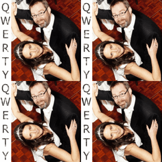
With the simple guidelines from Typecast I was able, eventually, to create a grabable button which I now display on my right side bar. I'm not sure that anyone would ever 'grab' it for their own blog but having it there reminds me of the sense of achievement I felt when I got it to work and I am rather proud of my sparkly letters!
If you give it a go yourself, be warned, a simple space in the wrong place can make a big difference when you are using HTML. Accuracy is essential.
I also amazed myself by adding a favicon (favourite icon) that hopefully, you can see personalising the URL address bar. I'm not convinced the image works too well as it is such a tiny little thing but again, it's very presence makes me feel that I'm not such a techno dunce as I sometimes fear. I owe my triumph to The King and Eye's tutorial.
It does make me realise three things:
- How far I have come since September 2010 when I wasn't really sure what a blog was
- How much I still have to learn, and
- How much support there is out there as we journey together.
I am wondering what my next step into the unknown will be and feel reassured that I will not be making it alone.


Oh yay, I am delighted you got the favicon up and it looks GREAT :D Thanks for the mention too, appreciate that :) Jen
ReplyDeleteOoh nice button and favicon! Always wondered how they get those little pictures in the address bar. Might have to invest a little time in getting me one of those!
ReplyDeleteNice work :D x